
When it comes to large format printing, the stakes are high! Your designs have the potential to captivate audiences, whether they’re gracing a vibrant banner, an eye-catching exhibition stand, or an impressive flag. But before you hit that print button, it’s crucial to prepare your artwork with care.
The quality of your prints hinges on proper preparation, and understanding the dos and don’ts can make all the difference. In this blog, we’ll explore common design mistakes in large format printing and provide you with practical tips to avoid them!
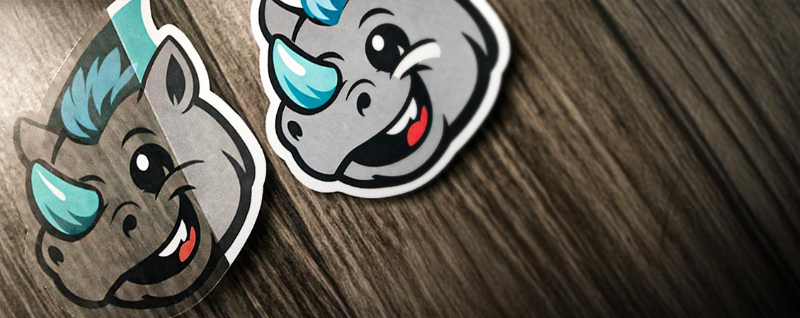
1. Don't Use Low-Resolution Images
What: Image resolution refers to the level of detail an image holds. It determines the quality and clarity of an image, especially when printed or displayed. Resolution is typically measured in terms of pixels (for digital displays) or dots (for print).
- Avoid: Using images with low DPI (dots per inch)
- Tip: Always use high-resolution images (at least 150 DPI) for clear and crisp prints.
2. Don't Forget the Bleed
What: Bleed in print refers to the area beyond the edge of the final trimmed size of your print product. It ensures that the design or background extends slightly past the cut line, preventing white edges if there’s any minor shifting during the cutting process.
- Avoid: Leaving important elements too close to the edge.
- Tip: Always include a bleed area (usually 3mm to 5mm) to prevent white borders after trimming.
3. Don't Ignore Safe Zones
What: A safe zone in print is the area inside the trim line where all essential content—like text, logos, and important design elements—should be placed to ensure they aren't accidentally cut off during trimming.
- Avoid: Placing crucial elements (text, logos) too close to the cut line.
- Tip: Keep all essential elements at least 20mm inside the cut line to prevent cropping.
4. Don't Design in RGB Colour Mode
What: RGB and CMYK are colour models used for different purposes in digital and print media.
- Avoid: Designing your artwork in RGB, which can lead to colour discrepancies in print.
- Tip: Use CMYK colour mode for accurate colour representation in prints.
5. Don't Skimp on Text Legibility
What: Text legibility refers to how easily individual characters and words can be read. It focuses on the clarity and distinguishability of letters, ensuring readers can quickly recognise and understand the text.
- Avoid: Using fonts that are too small or overly complex.
- Tip: Ensure your text is large enough to be easily readable from a distance.
6. Don't Forget to Check Alignment
What: Alignment in design and typography refers to how text and other elements are arranged relative to a page, margin, or each other. It ensures a clean, organised look and helps guide the reader’s eye.
- Avoid: Misaligned graphics or text that can look unprofessional.
- Tip: Always double-check the alignment of your elements for a polished look.
7. Don't Use Too Many Fonts, Colours, Patterns or Images
What: In print, fonts affect readability and tone, while colours ensure brand consistency and evoke emotions. Patterns add texture and visual interest, and images enhance storytelling and engagement, with high-resolution files ensuring clarity.
- Avoid: Overloading your design with multiple design elements
- Tip: Stick to one or two complementary fonts to maintain consistency and readability, keep patterns and colours consistent with your brand and use quality images.
8. Don't Forget About Layout
What: In print, layout refers to the arrangement of text, images, and other design elements on a page. It determines how information is presented and guides the reader's eye, ensuring clarity and effective communication.
- Avoid: Ignoring how the design will look on the final product (e.g., banners that wrap around).
- Tip: Visualize the layout in context to avoid losing key information in folds or curves.
9. Don't Skip Proofreading
What: Proofreading is the process of reviewing written content to identify and correct errors in grammar, spelling, punctuation, and formatting before finalising a document. It ensures clarity, coherence, and overall quality, helping to maintain professionalism in printed materials.
- Avoid: Sending designs without checking for typos or errors.
- Tip: Always proofread your text and have someone else review it for a fresh perspective.
10. Don't Rush the Review Process!
- Avoid: Sending files to print without a thorough review.
- Tip: Take the time to review your artwork, and consider getting a second opinion.
Design Do's for Large Format Prints
1. Do Use Our Free Templates
Take advantage of our downloadable templates to ensure your design meets the correct specifications for size and bleed, making the setup process smoother.
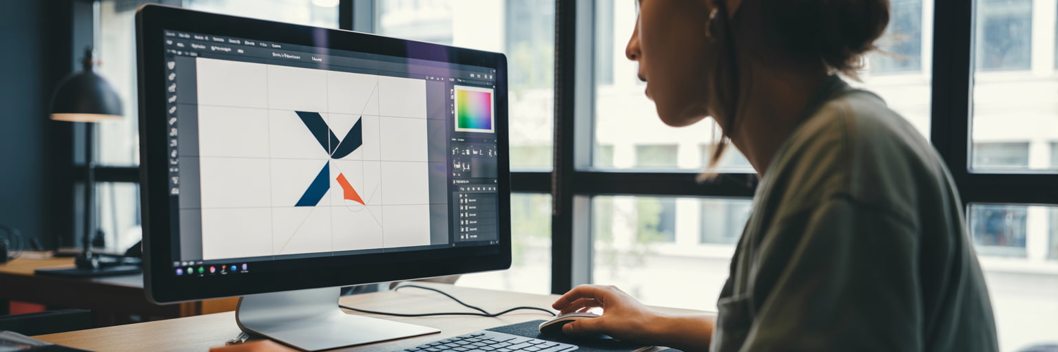
2. Do Utilise Our Free Design Online Tool
Make the most of our free design online tool, which simplifies the creation process and helps you visualise your design before printing.
3. Do Read Our Blog for More Information
Stay informed by reading our blog, where you can find valuable tips and best practices for preparing artwork for large format printing such as:
- Print Resolution - Image Resolution for Printing Guide.
- File Type and Size Guide for Printing
- How to Upload & Proof-Check Artwork for Print.
4. Do Speak to Our Team
Don’t hesitate to reach out to our studio team of artworkers. They’re here to help you with any questions and provide a free 10-point artwork check to ensure your design is print-ready.
Conclusion
Preparing artwork for large format printing doesn’t have to be a daunting task! By following these best practices and avoiding common design mistakes, you can set yourself up for success and ensure that your prints come out looking vibrant and professional.
The right preparation can make all the difference in achieving eye-catching results that truly reflect your vision. So, roll up your sleeves, get creative, and let’s make your next large format project a standout success! If you have any questions or need further assistance, feel free to reach out—we’re always here to help!

.jpg)