
Are you looking to buy our exercise books and come across our ‘maximum 20% total area coverage’ rule and thought, “What on earth does that mean?” Don’t worry - we’ve got you covered!
That’s why we’ve created this helpful blog to make it ridiculously easy to understand. So grab a cuppa, sit back and let’s break it down.
Why Do We Have a Maximum 20% Area Coverage Rule for Exercise Books?
In a nutshell: less ink over a smaller area = lower prices. That’s why we limit total area ink coverage on exercise books - so you get an affordable product without breaking the bank. Exercise books are designed to be budget friendly, and sticking to 20% total area ink coverage helps keep costs down while ensuring the pages remain easy to use. Too much ink can make pages look cluttered, harder to write on and even impact readability.
This is where our Truepress printer comes in. It’s an efficient, high quality printer that’s perfect for printing light coverage books. By keeping the ink usage within the 20% rule, the Truepress ensures you get crisp, clean pages at a lower cost, without sacrificing quality.
Think of it like decorating a cake - a little icing makes it look great, but too much and you lose sight of the cake itself!
Advanced Description: TIK and TAC - What Do They Mean?
Here’s where it gets a little technical, but we’ll keep it simple:
- TIK (Total Ink Coverage) is how much ink is in one spot. If you stack 100% Cyan, 100% Magenta, 100% Yellow, and 100% Black on top of each other, you get 400% TIK - a super rich, jet black colour.
- TAC (Total Area Coverage) is how much of the entire exercise book actually has ink on it. If that 400% TIK black ink covers 25% of your exercise book, your TAC would be 100%. For an exercise book, your TAC needs to be under 20%.
So, if you have 400% TIK and that coverage is over 25% of the entire exercise book, the calculation would be:
An easy way to think of it: TIK is how thick the paint is and TAC is how much of the wall you’ve painted.
How to Nail the 20% Total Area Coverage Rule - 4 Easy Rules
Worried about accidentally going overboard? Here’s how to tell if your design is within the magic limit:
Keep It Light to Keep It Right
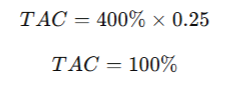
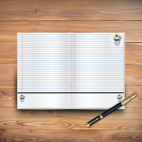
✔ Good: A neat school book with a lined margin, a tiny logo in the corner, and black text.
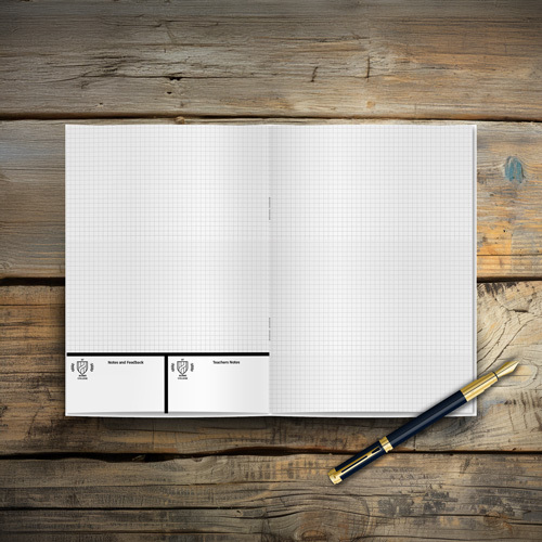
❌ Not So Good: A page drowned in colour, looking more like a piece of modern art than an exercise book.
 VS
VS 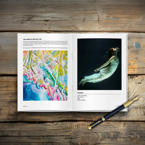
Avoid Heavy Background Colours
✔ Good: A crisp white page with small, clear headings.
❌ Not So Good: A fully coloured background that guzzles ink like a thirsty camel.
 VS
VS 
Small Images & Logos = Big Wins
✔ Good: A small, simple, single-colour logo tucked away neatly.
❌ Not So Good: A giant logo taking over the entire page like it owns the place.
 VS
VS 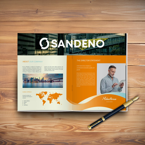
Less is More
✔ Good: Lined or grid pages with a faint watermark logo.
❌ Not So Good: Pages packed with borders, illustrations, and enough graphics to make your printer cry.
 VS
VS 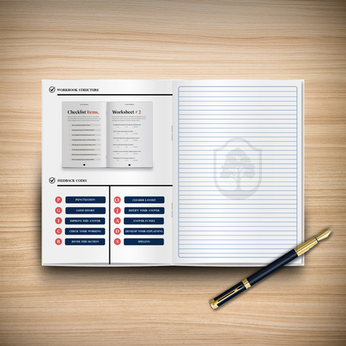
How Can You Make Your Design Work?
If your design is too ink heavy, you have two choices:
- Reduce the ink saturation (less intense colours), but this may affect print quality.
- Increase the total page count (for example, adding extra pages with faint lines spreads the ink use across more area, reducing overall TAC).
But Don’t Stress, We’ve Got Your Back!
If your design is a little too extra, don’t worry! We’ll highlight this when you upload your artwork and tell you exactly what changes you need to make to meet the 20% ink coverage rule. If you want to avoid surprises, just follow these easy peasy tips when creating your artwork.
The Bottom Line?
Sticking to less than 20% ink coverage is a win win. You get awesome exercise books without the extra cost, and your pages stay neat and easy to write on. It’s that simple!
Still unsure? Give us a shout! We’re happy to help (and we promise we won’t make it complicated).
.jpg)


.jpg)