What Is a Brand Guideline?

Your brand guideline (AKA brand standards, brand book, style guide, brand bible, brand identity guide – whatever you want to call it) is a set of rules outlining how your business presents itself to the rest of the world, from your company logo design to your brand’s colour palette. This helps maintain consistency around your brand look and voice so that when you’ve got different people working on different levels with customers, your style of communication stays the same. For example, your customer service and marketing team will have the same voice when responding to customer queries as your finance director at a networking event when he’s asked who your company are and what they do.
Although your brand guideline shouldn’t be so strict as to stifle creativity, having a definitive set of rules on how certain things are done in your company is really helpful to help new members of staff get to grips with how the business is run during their orientation period.
Now that we’re clear on what brand guidelines are, here are the key elements you need to include in your own!
Introduction
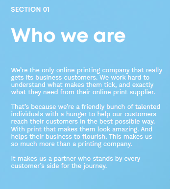
Although brand guidelines are used by the majority of businesses, there’s a chance that some people may never have seen one before. Take a little time to explain what the brand guidelines are and what their purpose is. In our introduction, we explain that our brand guideline acts as a way of nurturing our distinctive look at voice to create consistency across all communications, as well as briefly explaining the kinds of things we’ll be talking about later in the guide.
Contents Page
Different members of staff will need to be able to refer to specific parts of the brand guideline at different times. By having a contents page, this makes finding the section you want quick and easy – meaning that colleagues are more likely to follow the standards set by the guideline properly.
Who You Are

This is where you give a little more info about who you are and what you do. This could include a mission statement or an ‘About Us’ style section. For an added personal touch, why not add in a quote or letter from your company’s CEO? Here are a few subsections you should definitely feature in your brand guidelines:
- Your Business’ Story
A good business is built on its brand narrative, but, just like any great story, you should always keep the plot structure in mind. You should also hope to trigger some kind of emotional reaction from your readers (note: this doesn’t have to be sadness! Think excitement, happiness, empathy). For a full guide on creating a captivating brand narrative, check out this really helpful blog.
- Brand Values
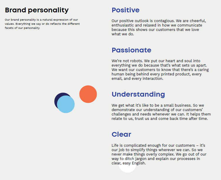
Brand values are arguably one of the most important parts of your brand guideline – because each value should be reflected in everything you do, from how you look to how you talk and how you communicate both internally and externally. Here at instantprint, each and every one of us strive to be straightforward, friendly and approachable – we want our customers to have confidence that we’ll happily help them through their print journey, so they can get in touch with us at any point in the process with any question.
- Personality
Take some time with your team to brainstorm 3-5 adjectives that describe your brand. These could be quirky, traditional, innovative, trendy, empowering, collaborative – they need to be the adjectives that come to mind when people think about your company. These adjectives are also important for influencing the content of your brand guideline as they are the natural expression of your values – this is how you bring your values to life.

- Tone of Voice
How do you talk? What is your brand voice? Think again about your brand personality when deciding how you would like to come across to both customers/clients and colleagues. Communication comes in many different forms for a business. Here, you can discuss the different ways you’ll be communicating; through your blog, emails, telephone conversations, at an event or lecture, or even through your product Brochure and Flyers.
In your brand guideline, it’s a good idea to include some example snippets of conversation to inform colleagues of how to talk in a way that reflects your brand personality. In our brand guideline, we give examples of what not to say, as well as how to reword that to reflect our brand tone of voice. For example, we keep things positive by avoiding the passive voice, and instead use the active voice when talking to our customers:
We say: We’re going to deliver a superbly printed brochure
We don’t say: A superbly printed brochure will be delivered by us
It’s also a really good idea to include some example copy as well as conversational text. Including your mission statement in varying lengths – from a short, one sentence tagline and a longer elevator pitch, right up to several paragraphs of brand introduction – is a great way of showcasing your fantastic new style of copy. Or, why not try including a few examples of sales copy?

Logo Guidelines
In this section of your brand guidelines, you should show how your company’s logo design should be used. For this, there are a few things to consider:
- Logo Colourways
A colourway is a range of colours a design is available in. For your logo design, it’s a good idea to keep your colours as consistent as possible whenever and wherever its used. However, in some situations (where your logo may be illegible due to background colours), you’ll need to consider appropriate ways of displaying your logo. We have three logo colourways:
- Master Logo: Our default logo which always appears in our brand colours. This logo’s colours are black and pink.
- White Logo: When our logo is displayed on a dark background, we use a white version to help it stand out.
- Mono Logo: If only one colour print is available, for example in newspapers or on printed receipts, we use our mono logo.
- Logo Size
There’s nothing worse than a stretched-out logo. Your brand guidelines should include the minimum size your logo should be and the proper proportions – so that if it does need to be bigger, the dimensions are all still right!
- Logo Placement
To ensure that your logo is communicated effectively, it’s a good idea to leave some white space around it (this is also known as the safe area). By including the specific instructions for how much safe area your logo needs, this helps keep everything that features your logo consistent, creating a sleek, professional impression of your brand.
You should also specify whereabouts your logo should be placed on printed documents and online. We have specific rules around where we place our logo on letters and Business Cards, as well as on our website and how our logo should look across all our social media channels.
Typography Style
Another huge part of defining your brand identity and for keeping everything consistent, is your font selection. It’s up to you if you want to use one font across all communications, or if you want to establish multiple complementary fonts.
We have two main fonts that we use (which are the same for both web and print); one for our headings, and one for our copy. This way, our headings stand out from the main body of text, but everything still works really well together and our typography is consistent across the business.
Colour Palette
For your brand colours, you’ll need several colours that work well together, and match the values and brand personality you created earlier. We have 4 primary colours and 5 secondary colours we use to create a consistent brand look. We recommend picking a lighter colour that works well for backgrounds and a darker colour for text. It’s also a good idea to break your colours down into PANTONE name and number, CMYK, and RGB and HEX codes.
Imagery/Photography Style
From your product images on your website, to social media assets, and even staff photos, you should keep the visual style you’ve created with your colour palette and values in mind. Include some examples to show imagery best practice or create a mood board to set the standard of what you expect from your brand’s imagery. Just make sure to highlight that colleagues should keep the feel, the lighting, the settings and style consistent.
Now you have all the essentials for creating your new brand guideline, it’s time to get started. Make it a collaborative effort by gaining input from every team in your business – that way everyone in your company will be excited to show that you’re more than just the products you sell!

 (1) (1).png)


