Updated: 15th May 2023
You’ve got a big event coming up. You’re excited and eager to spread the word around town by handing out leaflets to raise awareness. But hold your horses. Before you blast through the design, ask yourself the all-important question: what is a leaflet actually meant to include? From colouring and branding to choosing that all-important title, there’s plenty to think about if you want to maximise the effectiveness of your promotion.
Follow this checklist to ensure nothing is forgotten and your leaflet keeps its edge…
What to Include in a Leaflet
1) Your brand colours and logo
Kerrie Hughes from Creative Bloq can’t stress the importance of colour in leaflets enough. She says colour needs careful consideration in order for the leaflet to achieve its purpose, which makes it vital to use colours people can associate with your company.
When people see your leaflet you want them to instantly recognise it’s you. Notice most of Virgin’s advertisements are red, and Sainsbury’s always include a splash of orange. Keeping branding consistent across all your marketing materials will make your business stick in people’s minds.
2) Make It Different to Other Leaflets
Although general colouring and fonts should stick to your brand, be wary of re-hashing old leaflet designs that you’ve used for previous events or offers, and merely changing the dates. Customers can easily become immune to identical images which they are exposed to day in day out, meaning your advertising becomes stagnant and ineffective.
Keeping within your brand, experiment with different leaflet layouts and wording to put a fresh spin on your promotions that keeps customers engaged. You can even try a variety of leaflet designs for the same event or offer to advertise different aspects, and make each customer think every time they see it.
Sainsbury’s ‘Little Twists’ campaign utilises the same theme, fonts and colours throughout their leaflets and posters, however each has different content. This means the message is still being repeated and therefore ingrained within their customer’s minds, without the risk of becoming obsolete and invisible. The images below have been used across their print advertising and online efforts which reinforces their branding and creates a huge impact!


Sainsburys
3) Don’t forget the details
It may seem glaringly obvious, but it’s so easy to get carried away with striking imagery that the purpose of the leaflet gets swept under the rug. Designer Joshua Johnson from Design Shack swears a leaflet needs to include the magic three; who, where and when as a minimum for any effective leaflet.
Think about what the leaflet is trying to achieve and use this as a basis to plan the information. Where do you want your readers to go next? Only including the location and time of your event is useless if you don’t say where to buy tickets. Do you want them to give you a call, visit your site or drop into your shop? This is direction to act is called a ‘Call to Action’, and is used in marketing to encourage customers to act upon your advertisements – which is key for a successful leaflet distribution campaign.
Avoid paragraphs and paragraphs of text but keep your sentences short, concise and informative. An easy way to do this is to write a list in order of importance for each factor you need to include. This could follow the process of:
- Name of the event/ offer or shop
- Location
- Dates
- What’s included? For instance, products available in the offer, listings for the event or new items you have on sale.
- How do the customers respond? Give a phone number to contact, a website to visit or an address to find.
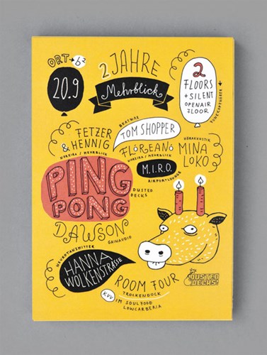
Simply put the most important information in a larger font, such as the name of the event or the purpose of your offer and stagger the sizes of text down through your list. This is a sure-fire way to ensure all information is included and presented in a clean, attention grabbing manner. This leaflet example does exactly that!
Creativebloq
4) Your Target Audience
Whose hands do you want this leaflet to fall into? You need to fine-tune your tone of voice to attract potential customers. You can research similar companies with successful advertising to see what others in the market are doing, or simply put yourself in their shoes.
It’s marketing 101 that bold reds immediately connote to a discounted sale, and is great for snatching bargain hunter’s attention. Fun illustrations and bright colours will help grab a child’s attention, whilst neutral and pastel colours can promote a more luxurious product for perhaps bigger spenders.
You’ve also got to consider what aspects of your business your target readers are interested in. Is it the price, the amazing products you’re selling or something different no one else in the market is offering? Choose the messages that will really make your audience stop and turn.
You want to keep text to a minimum, but choosing the right words is essential. Charity leaflets often use strong, emotive language to arouse a passionate response. Other leaflets limit the wording to exactly what they have to offer, for example “Coffee, Cakes, Chat” for a café.
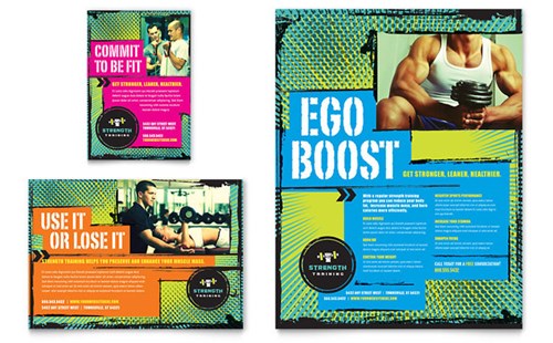
The leaflets below for personal training use strong slogans of the effects of exercise to entice the reader. This immediately tells the customer how they can reap the benefits of their business, appealing directly to the customer’s emotions and desires instead of leaping into a description of the company itself.
Stock Layouts
5) Speak directly to your customers
To appeal directly to a customer regardless of their interests, age or gender, use the words ‘you’ or ‘your’ in the leaflet’s text. Tim Riesterer from Marketing Profs explains that ‘by using the word ‘you’ instead of ‘we’, you transfer ownership to your customers because it causes their minds to unconsciously ‘try out’ your solutions.’ In other words, you’re putting your customers at the centre of your story, and engaging them directly in conversation.
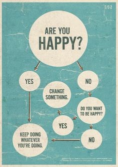
Asking a question in your title that your business can answer will help start a visual conversation between you and potential customers. ‘Are you hungry?’, ‘Fancy something different?’, ‘Looking to get fit?’ are all simple and direct questions which will gage responses from customers and enlighten them to your business!
flyergoodness
Here are a few more leaflet writing examples to inspire your own sales copy.
6) Spacing
The biggest crime in flyer design? Cramming too much onto the page. One striking image, big gaps between text, and blank spaces all collate to a show stopping leaflet with a dramatic edge. Following these rules will make your text easier to read, your images more defined and more memorable.
If you find there’s too much to say and not enough space then you might need to adjust your leaflet size. A4 leaflets have plenty of room for lots of information, and will allow you to present more details without comprising on space. You can even make smaller versions of your leaflet, down to A6 and A7 sizes, with less information, but used more as a reminder for a quicker, more concise advert.
If you find a flat leaflet doesn’t hold all the information you need, spread out the content with a folded version.
Smashingbuzz
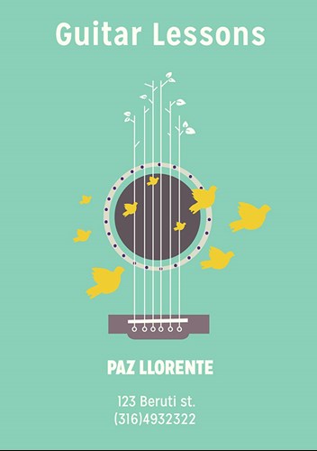
This business leaflet is a beautiful and alternative way to promote guitar lessons. The large empty space filled with a block colour initially grabs the reader’s attention, whilst the clever illustration of guitar strings with the simple title ensures the message is clear and projected across.
7) Eye-catching imagery
The best leaflet designs are bold and daring with their images. If you sell food, try showing a mouth-watering image of your best looking product close up. If you need something more abstract, experiment with bright, contrasting colours which draw in the eye.
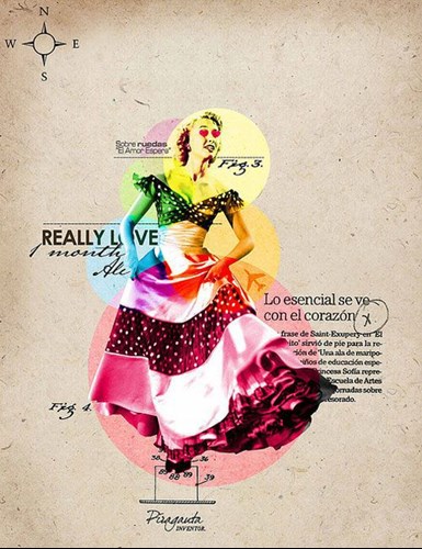
However, Garr Reynolds famously stated in his book on design fundamentals Presentation Zen Design; “if everything is high contrast, nothing stands out”. Try using a toned down background to make the colours pop out and act as a magnet which pulls the reader’s eye to a point on the leaflet.
This leaflet follows this rule exactly. A black and white image is highlighted by multi-coloured circles which cover different parts of the woman. Against a neutral, stone background, a monochrome flyer is brought to life in a fun filled fiesta of a flyer!
Shydesgins
8) Choose a title that says it all
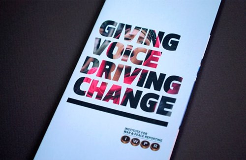
Leaflets have to get their message across in an instant. Marketing Week reported that only 4% of advertisements are looked at for longer than two seconds – which is just enough time to absorb the title. If your title is captivating, it will encourage readers to engage with the smaller text that tells them more.
This leaflet cleverly uses the large, bold text as a fragmented frame for its image which ensures the title is forceful and predominant. The message demands attention, and showcases how a strong title can drive the direction of a leaflet.
hongkiat
Conclusion
We hope we’ve walked you through what a leaflet is meant to include in enough detail to get you designing and promoting your business! Use this guide as a checklist to create a successful leaflet marketing campaign in no time. Want some more leaflet design tips? Check out The Anatomy of a Flyer for a thorough inspection of the aspects of the leaflet.
Or are you raring and ready to start designing? You can find our free leaflet templates here.


